Package Design & Brand Positioning
The problem
LD Snus wanted to take on Swedish Match, the category giant that owned shelf space, pricing power and brand recognition in nearly every store in Sweden. Every major competitor chasing the same high-end market: glossy, pompous, aggressively masculine, and in English despite snus being about as Swedish as it gets.
The real problem
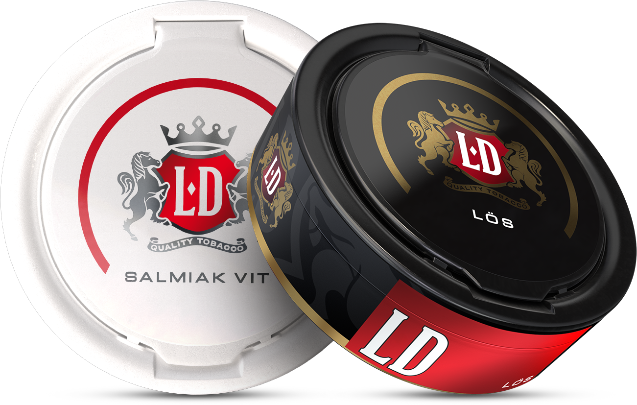
Fighting on cost per snus against that kind of incumbent is a losing game. The opportunity was in the white space they'd all ignored, combining Swedish heritage, visual distinction, and a colour system that made sub-brands legible at a glance.
Volume at a ≈30% discount was the angle, but that meant finding cost to shave without touching perception. Gifting fridges instead of renting shelf space was one. The bigger one: how can we work with "this is known"-truths? ask a Swede how many snus come in a can and they'll say 24. That's SwM indoctrination — ours had less, and we never got a complaint... We then applied the same logic to "strength". Snus-Swedes equate strong with tobacco strength, but just like there's no saltier-salt, there's no such thing as extra-strong tobacco. You can however have a strong flavour and cut some of the taxable nicotine accordingly.

What changed because of it
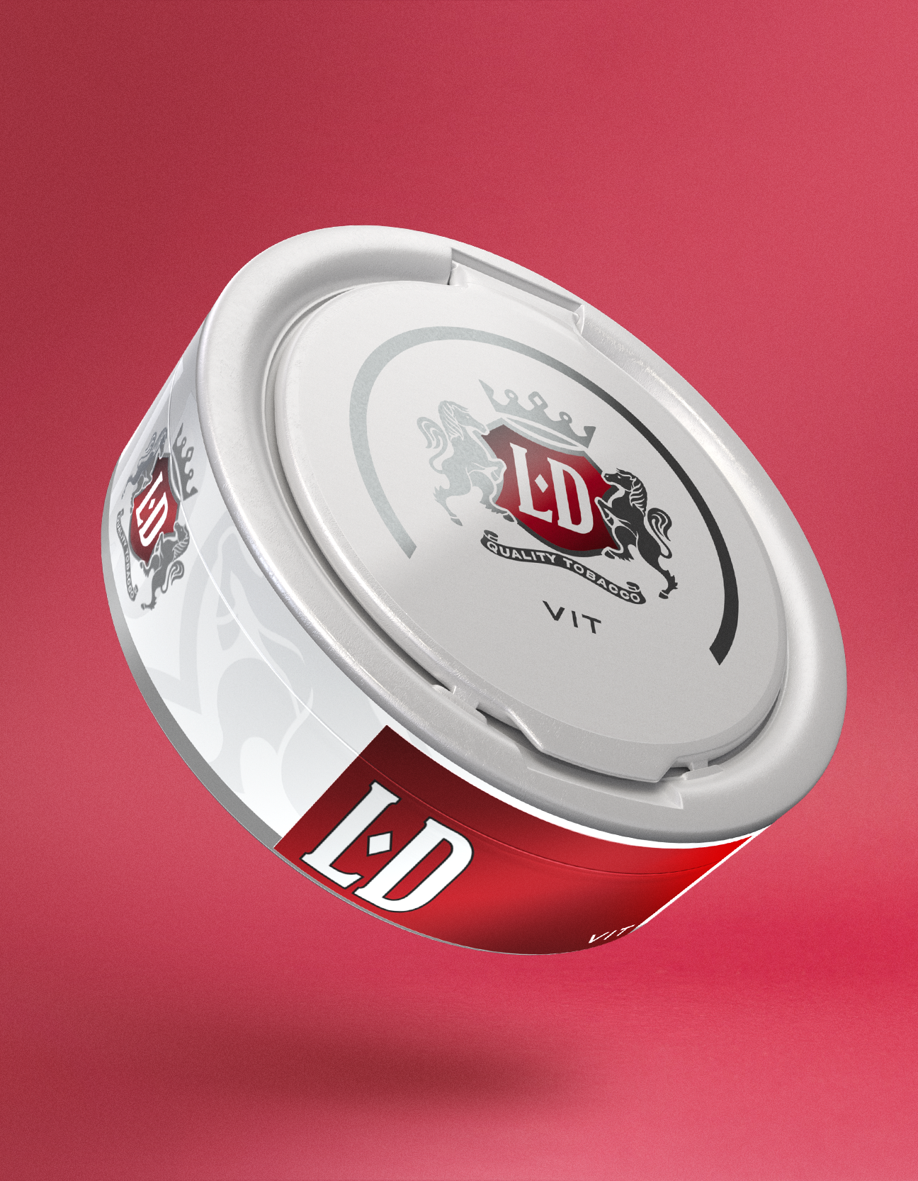
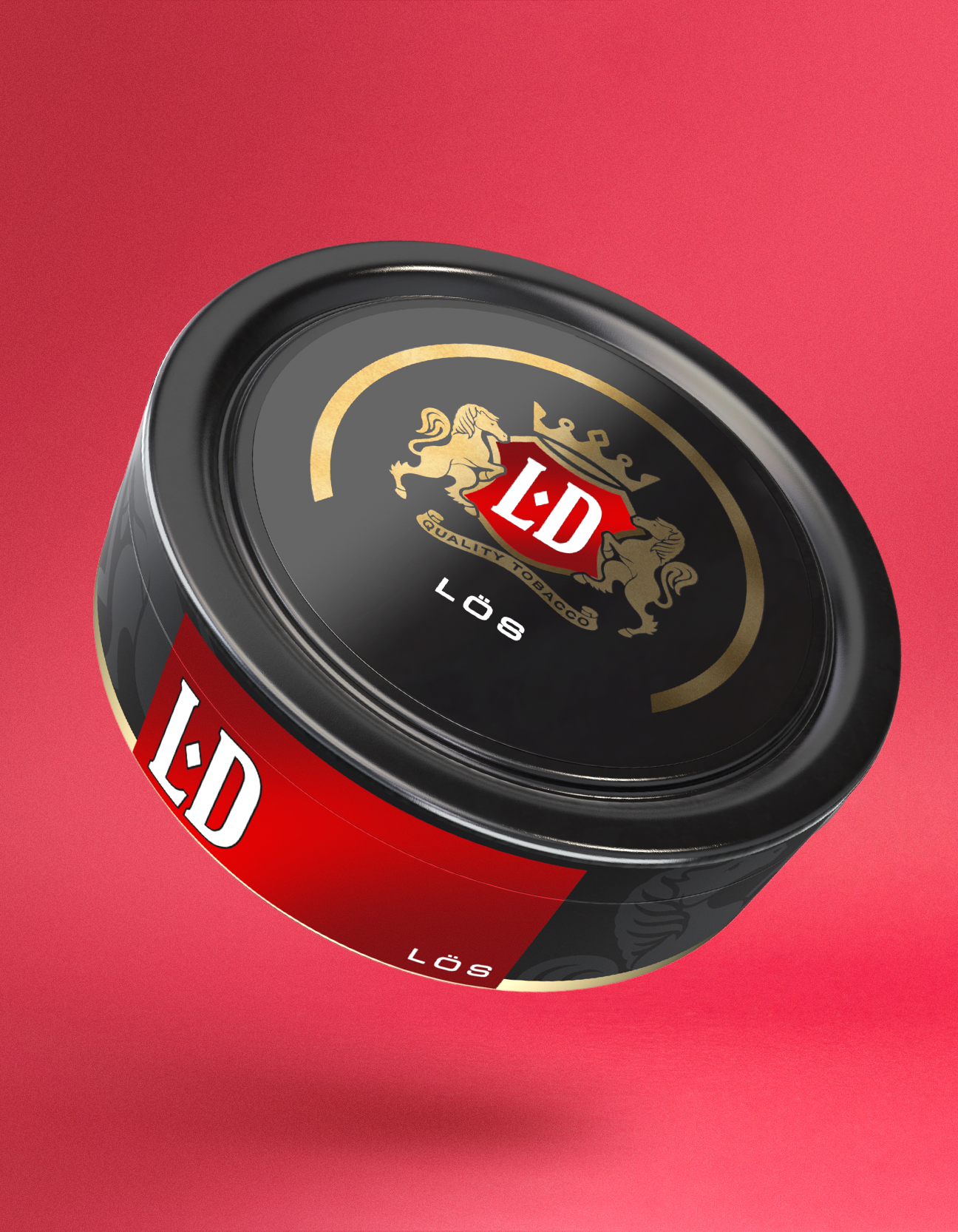
LD's total share of market tripled within months. It seems our Swedish copy influenced the competitions as more fully Swedish branded tobacco is available today. The white can for LD Vit, a deliberate contrast in a category defaulting to black and brownish-gold, became a distinguishing mark in every store it entered.
What I did
We competed internally at Fältman & Malmén to win the project. Speedy iterations, printed labels, physical prototypes, push for 3D rendering (wasn't standard). Advocated for the white can and Swedish copy direction. Experimented with shapes and materials — built out multiple campaign versions before landing on the orange and torn-label look that the moment we saw it we knew was the one.
My role
Designer at Fältman & Malmén with an Art Director. She was the voice with the client. I was the engine, exploration, iteration and the ideas that pushed beyond the brief.